
Why _____ is key to your brand. Part 1: Colour
When it comes to your brand, the colours you use are about much more than just making it look pretty. Colours play a huge part in how we see the world – they impact our emotions and, as a result, influence the way we behave.
When done properly, your brand colours should form a core part of your identity. They’ll reinforce your brand values, shape your personality and play a massive part in making your brand consistent and recognisable. For that reason, the colours you use and the combination in which they’re used should be the result of a careful process.
Why colours are important
Recognition
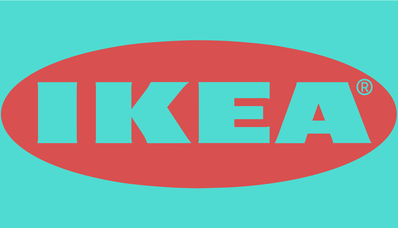
Look at the images below.

My guess is within seconds, you could identify each and every brand represented in these images. That’s because these brands have become synonymous with these colours. They’re as much a part of their identity as any imagery they use, slogan or even their products. Studies have shown that using colour as a core part of your brand can boost brand recognition by up to 80%.
Brands become so intrinsically linked with the colours they use that to see their logos in other colours can create real unease.

Perception
The psychology of colour theory is fascinating. It’s proven that different colours make us feel different things. Whilst there’s no doubt that this differs slightly from person to person, there is are undeniable trends.
This is why you’ll find a great number of financial institutions use a specific shade of blue – as it represents safety and security, something people want to feel when it comes to their money. Very few of these organisations would go anywhere near shades of red that invoke feelings of passion or danger – for obvious reasons.
All colours carry positive and negative associations and both should be considered when choosing your own. Choose a colour for its positive associations and ensure you’re aware of the negative – ensuring these don’t weaken or contradict the perception you’re trying to put across.
Thinking about how you want your customers to feel when interacting with your brand and choosing colours accordingly can be an incredibly powerful way to encourage interest, interaction and loyalty.
Personality
When working with clients on their brand, we talk a lot about personality. What’s your brand personality? Are you bubbly and fun? Are you serious? Are you kooky?
There are then several elements of your brand that combine to communicate this personality and colour is a crucial one. Neon pinks aren’t going to help you create a serious image and navy blues certainly won’t make you appear kooky. Establishing your brand personality and then using this to guide your colour choices will help you build a recognisable brand personality your audience will resonate with.
Consistency
We talk a lot about the importance of consistency in effective branding. When so much thought has gone into the image you want to convey and the emotional reactions you want to invoke, it’s essential that this is captured across every aspect of your brand communications. Otherwise, your message becomes muddled and diluted and all that work will have been for nothing.
Establishing your brand colours and ensuring they’re used properly across all platforms will go a long way to ensuring your brand is consistent, recognisable and representing the real you.
Picking your brand colours
As I said towards the beginning of this article, choosing your brand colours should be part of a process but to start you off:
Whilst there is a huge amount of psychology you can incorporate into your decisions, possibly the most important influence should be your gut feeling. You know your company and therefore will likely have an idea of what kind of colours feels right for you. This may well just be a case of establishing what colours definitely aren’t right and ruling them out.
It’s also important to consider your audience and whether there are any colours they’re likely to not respond to or particularly resonate with. An older audience may not respond to neon, whilst a younger audience may be put off by more bland and corporate colours.
Most brands will have at least three colours as part of their palette
- Core or Base colour (this should be representative of your most prominent personality trait or value)
- Accent (this will often be used alongside your core colour so shouldn’t clash, it should also have relevance to another personality trait)
- Neutral (This will often be used as a background colour so should work with both your core and accent colours, they should stand out against it – popular choices will be greys, whites and creams or darker blacks and navy blues)
Once you have these three in place, you may choose to expand your palette – potentially including another core colour and another colour to work as a background. To start with we’d recommend not going beyond five or six colours.
Another key consideration when picking your colours is accessibility. For example, some colours create problems for those with colour blindness – especially in certain combinations. Testing your colour choices for such things will help ensure your brand has maximum impact with everyone.
So, there you have it. A brief (ish) summary of why your brand colours should be a core part of your brand strategy. We could talk for hours about colour and why it’s as important as it is but we’ll leave you with the above for now. If you want to discuss further, you know where to find us.
Recent thoughts
“I wish I were big”
"I wish I were big"Last weekend’s family film of choice was ‘Big’. We’re trawling through 80’s classics. Some have...
How to measure the effectiveness of your employer brand
How to measure the effectiveness of your employer brand. One of the questions we often get asked is how can we measure...
More signs your brand might need a refresh
We all know the feeling when you’re trying to say something important but can’t shake the feeling your words aren’t...
Our Branding Process
Four steps to crafting a winning brand identity. At MVMNT, we believe that designing or refreshing your brand should...


